


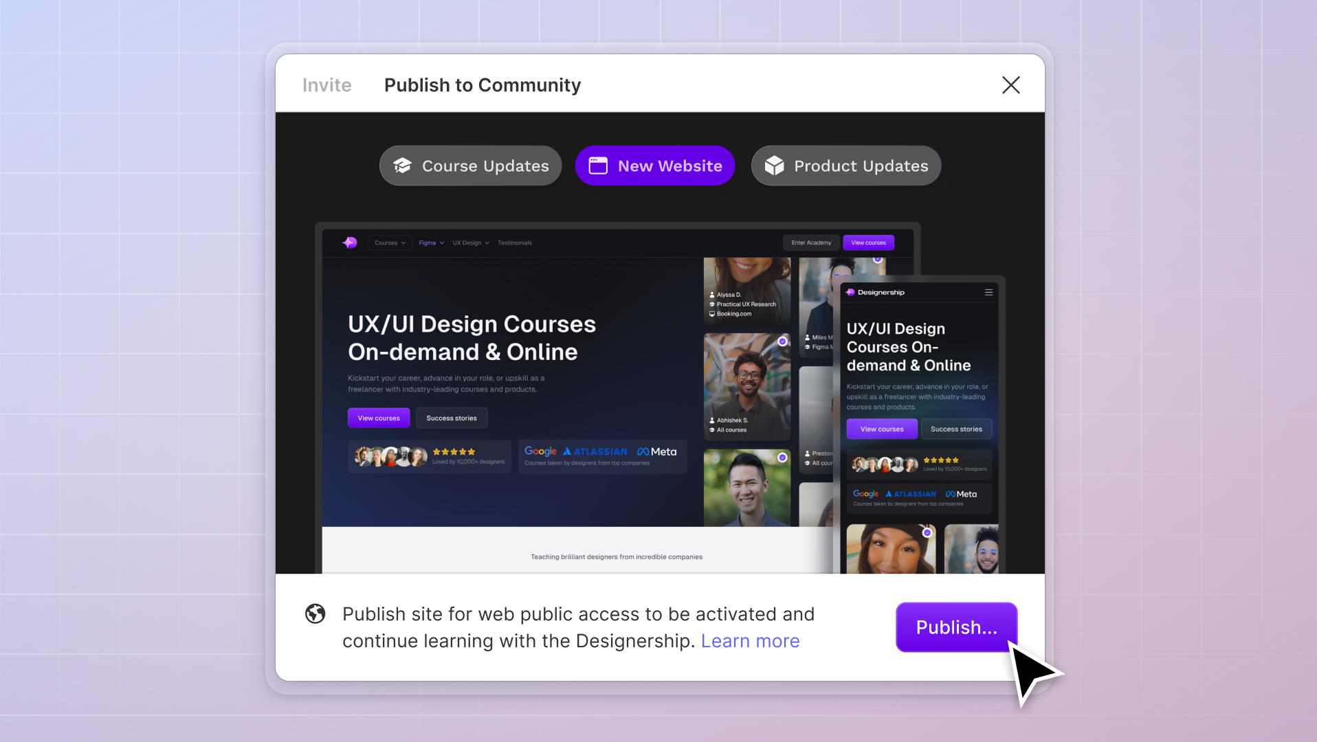
What's New
New website, course and product updates - April 2024
A lot happened this month. Take a look at what's coming.
Michael Wong
Apr 17, 2024
·
7 min read


Most UI design guides focus on the fundamentals. If you're serious about leveling up your UI design; to impress your stakeholders, then you're at the right place. In this article, we'll present six advanced UI Design tips to help you do all that and more!
Before diving into the advanced techniques, let's understand what UI design is.
User interface (UI) design utilizes visual elements such as color styles, typography, shapes, and more to create user-friendly interfaces for digital products. In this context, UI design is the process of designing how things look and work when you interact with software, websites, or other digital products.
There are different kinds of user interfaces that you can design, but the most common user interface is the Graphical User Interface (GUI). GUIs are all around us. It's the buttons, sliders, and form fields we see on everyday websites and mobile applications.
User Interface (UI) design shapes how users perceive and interact with digital products and services. UI designers build user interface designs to enhance their target users' experience.
By considering users' needs, UI designers can create designs that lead to
For instance, a good UI design can boost conversion rates by up to 200%, according to Forrester Research, while interfaces with great usability designs can improve conversions by up to 83%, task completion rates by 75%, reduce cart abandonment by 20%, and increase user task completion rates by 35%, as shown by Nielsen Norman Group.
In addition to driving business growth and improving user satisfaction, a great UI design has the power to create positive first impressions, enhancing brand awareness and credibility among your users.
It can also elevate the perceived value of your product or service. Just like in the fashion industry, a great aesthetic can enhance the overall perceived value, allowing you to potentially increase the rates for your services.
Let's deep-dive into some of the best advanced UI design tips and how to create a user-captivating design!

When you design user interfaces, whether for websites or applications, it's crucial to consider the diverse roles and needs of your users, but most of the time, most UI designers focus only on first time users without realizing there are other roles that they're missing:
All these three user roles will have different levels of expectations. So how exactly do you design while considering different user roles?

First time users are people who have just opened your website or application for the first time. These users don't usually know what your platform offers and would spend the time to explore the platform.
For example, let's take a look at the design of the Uber Eats app. When first-time users open the app, they are greeted with visually appealing elements highlighting its key categories, such as restaurants and grocery options. Including a prominently placed search bar and an informational banner explaining service fees helps address users' initial questions and encourages them to explore the app further.
The main goal is to create an interface that answers their questions and captivates their interest. As a UI designer, it's safe to assume you know nothing about this user. Consider putting yourself in the perspective of someone visiting a website or app for the first time.
First time users are often clueless about your products and services, and the best way to design for them is to provide a clear and intuitive user interface that guides them through the platform to convert them into paying customers.

Repeat users or customers are users who've already made their first purchase and are returning for the second time. When it comes to repeat users or customers, their familiarity with your platform calls for a different design approach. Unlike first-time users, repeat users don't need to be guided on how to use the app.
In the case of the Uber Eats app, when repeat customers open the app, they may have specific questions like "How do I reorder a past order?" or "How can I find my favorite restaurant or cafe?" Addressing these needs becomes a priority in the design space.
To cater to repeat users, we have redesigned the Uber Eats app with their specific questions in mind. Here are the key changes we made:
As a designer, your goal is to find ways to make significant improvements to the design without creating an entirely different one. Instead of starting from scratch, you can make a design more effective for your repeat customers by learning to prioritize key components of your product.

A super user has spent much time and information on the application. A super user is someone well-versed in the application and a regular of your product. For example, someone who's made over 50 purchases on the platform. These users have utilized your app a lot longer than other customers.
In the context of designing the Uber Eats app, this user's questions are centered on "How do I order my favorite meal?" or "Are there any alternatives to my favorite cuisines or restaurants that I always order from?"
It would be best to make engaging designs for Super Users - a more personalized approach, given that you already know much about this user. Include new features that will immerse your super users in the app and use your product.
By thinking quickly about different user roles, you can come up with attractive, different designs that fit your customers' needs. You can even further improve user identification by conducting user research and identifying user roles early in the design process.
This way, you can make informed decisions about information structure, navigation, content presentation, and feature prioritization while producing an unparalleled user experience.

Look at this example of an Error Modal that @jenninadler has refined. Here we see that from the initial Error Modal presented, she suggests five critical revisions to deliver the Error Modal's message:
Although these suggestions are helpful, we noticed two fundamental flaws in the revised Error Modal: conflicting messages and Call To Action (CTA) overload.
The revised Error Modal from the example above shows contradicting statements in its copy, a positive and negative reassurance. The positive reassurance is mentioned when the copy says that something successful has happened "Your changes were saved." However, the copy mentions an unsuccessful process right after - conflicting with the initial message.
These contradicting statements can confuse your users.
Apart from this, the revised Error Modal also has too many CTAs present in one component. Should the user exit? Should it 'Try Again'? Does the user 'contact Customer Care'? Should the user click on the hyperlink?
The number of CTAs on the Error Modal can also confuse or frustrate your users.
Having conflicting messaging and too many CTAs on this Error Modal shows your users that you haven't prioritized the best possible solution for them.
But there's a fix to this problem. And here's what we're proposing.

In our revamped Error Modal, we removed all other CTAs and placed only the most effective CTA for the user. Instead of pushing the user to do several things all at once, from trying again to canceling to contacting customer care, we recommend that your design calls for users to take on an action one step at a time.
In this case, we focused first on suggesting the user to 'Try Again.' If the error still occurs, the user is taken to the next Error Modal that suggests the next CTA: 'Chat with support.' This gives users a clearer view of the following steps they should be taking if they encounter the error. A seamless process and transition in such situations make for higher user satisfaction.
The messaging was also revised to be more concise. We've removed unnecessary statements that don't relate to the error message, such as "Your changes were saved." It is essential to be clear in your messaging; if it's an error, it's an error.

Visual reinforcement helps convey information and guide users effectively. Consistent visual cues, such as color, typography, icons, and layout, allow you to reinforce essential elements, actions, or messages throughout the interface.
Taking the sample from the previous section, although the messaging and CTAs have been improved on this Error Modal, there are still two significant issues that still exist here:
The original design of the error modal was improved by incorporating an icon to highlight the error message, enhancing user understanding without the need to read every word. While there are norms and standards for iconography and color, cultural perceptions vary, it is a topic to explore separately. By iterating on the design, visual elements were strengthened, but the 'Chat with Support' call-to-action (CTA) still required additional visual reinforcement.
To clarify that clicking 'Chat with Support' opens a new tab to a different website section, and an 'Exit' icon can be added. This visual cue helps users grasp the intended navigation. Visual reinforcements not only aid smooth platform navigation but also prevent unnecessary frustrations, resulting in an improved user experience.
Integrating visual cues and prompts allows users to interact with your design more seamlessly and enjoyably, enhancing their overall experience while minimizing potential confusion.

UI kits and Design Systems provide a collection of pre-designed user interface elements, such as buttons, icons, form fields, and other components. UI designers like you can save valuable time and effort by not creating these elements from scratch. But when should you exactly consider using UI kits and Design Systems?

Refer to this simple matrix above. This matrix shows on the X axis what type of interface you're designing for: website (more creative) or application (web or mobile, often more functional), while on the Y axis is your deadline length: extended or short.
Here's how you identify when to use a UI kit & Design System:
Existing UI kits and Design Systems are extremely powerful. A perfect example is Designership's Shipfaster UI. Within a couple of seconds, you can easily craft high-quality designs thanks to the pre-built components available in the UI kit.
With Figma UI kits & Design Systems, you can quickly customize sections of your designs with the variations available.
Using UI kits & Design Systems streamlines your workflow and provides consistency and coherence within your design. Figma design systems provide guidelines and reusable components that ensure unified visuals and excellent user experience across different interfaces and platforms.

Design System Slots aren't going to be relevant to all UI designers. It's probably more useful for an in-house UI designer or a UI designer working for startups or companies with a single product, such as Shopify, Instagram, Messenger, or Spotify.

Take a quick look at this modal from Designership's Shipfaster UI. There is only one way to create this modal - it's not very flexible. This modal is an instance of a component. Therefore, the content is not easy to manipulate. This modal is excellent for a UI designer working on multiple projects that don't require many customizations.
But if you're working on a project that requires numerous variations of a particular modal, creating Design System Slots is the way to go.

With Figma's design system slots, you can easily tweak specific modal properties, sections, and more without starting entirely from scratch. These component properties can then be easily modified or overridden when using the component in specific instances without creating separate component variants for every variation.

Like users, many UI designers may also encounter many frustrations with their design - especially when receiving feedback. You've probably seen designers post their designs and ask feedback with questions like:
"What do you think?"
"Any comments?"
"Would love to hear your feedback!"
And in return, these would garner vague feedback from "Looks good!" to "Great, can we decrease the icon size?" - This feedback doesn't get into detail about the overall design; it barely touches the surface and doesn't help you improve your design.
As designers, we value high-quality feedback that allows us to improve our designs efficiently and effectively. Here's how you improve the feedback you receive:
If you want to progress in your career as a UI/UX designer, one of the best practices in UI design to keep you ahead of the curve is to request proper feedback for your projects.
Remember to maintain a professional outlook and approach when requesting feedback. Be straightforward about the project and progress for better communication with your stakeholders.
When it comes to designing and being a designer, there are already many factors that you have to consider. But these UI design tips are guaranteed to make this design life easier for you.
Be well-versed in your UI design tools
Successful designers go beyond the basics of User Interface design and explore advanced techniques that can elevate their designs as UI/UX designers, one great trait is your ability to utilize and understand your tools, from visual elements to UI kits and Design Systems. Leveraging these tools can help you produce outstanding designs efficiently and effectively.
Know your audience, conduct proper user research
Another key takeaway from these UI design tips is to remember to prioritize your users. Conducting user research allows you to design for different user roles, ensuring that the interfaces are usable and relevant to all users, leading to a more positive user experience.
Meaningful feedback drives accelerated learning
It's also best to remember to seek feedback to improve your user interface designs actively. However, not all feedback is treated the same. Use our feedback template to frame your request effectively to garner the best results possible!
Most UI designers struggle to advance in their careers because they work slowly, lack a structured process, can't keep up with the fast-paced world of design systems, don't know how to hand UI designs over to developers effectively, and all the other things that come with being a UI designer.
That is why we have launched the Ultimate Figma & UI Design Masterclass. Our course has helped over 5,500 designers from all around the globe in:
The best part is that this end-to-end masterclass emphasizes practical, hands-on learning as taught by industry expert Michael Wong. This course also allows designers to enhance their skills and apply newly acquired knowledge in real-life scenarios.
Michael, better known as Mizko, provides a step-by-step guide to Figma and UI design. His teaching method and engaging content are sure to captivate every eager student's attention.
Don't take our word for it, our students have enough to say.
Mizko, also known as Michael Wong, brings a 14-year track record as a Founder, Educator, Investor, and Designer. His career evolved from lead designer to freelancer, and ultimately to the owner of a successful agency, generating over $10M in revenue from Product (UX/UI) Design, Web Design, and No-code Development. His leadership at the agency contributed to the strategy and design for over 50 high-growth startups, aiding them in raising a combined total of over $400M+ in venture capital.
Notable projects include: Autotrader (Acquired. by eBay), PhoneWagon (Acquired by CallRails), Spaceship ($1B in managed funds), Archistar ($15M+ raised) and many more.


.jpg)


%20(1)%20(1).jpg)