


What's New
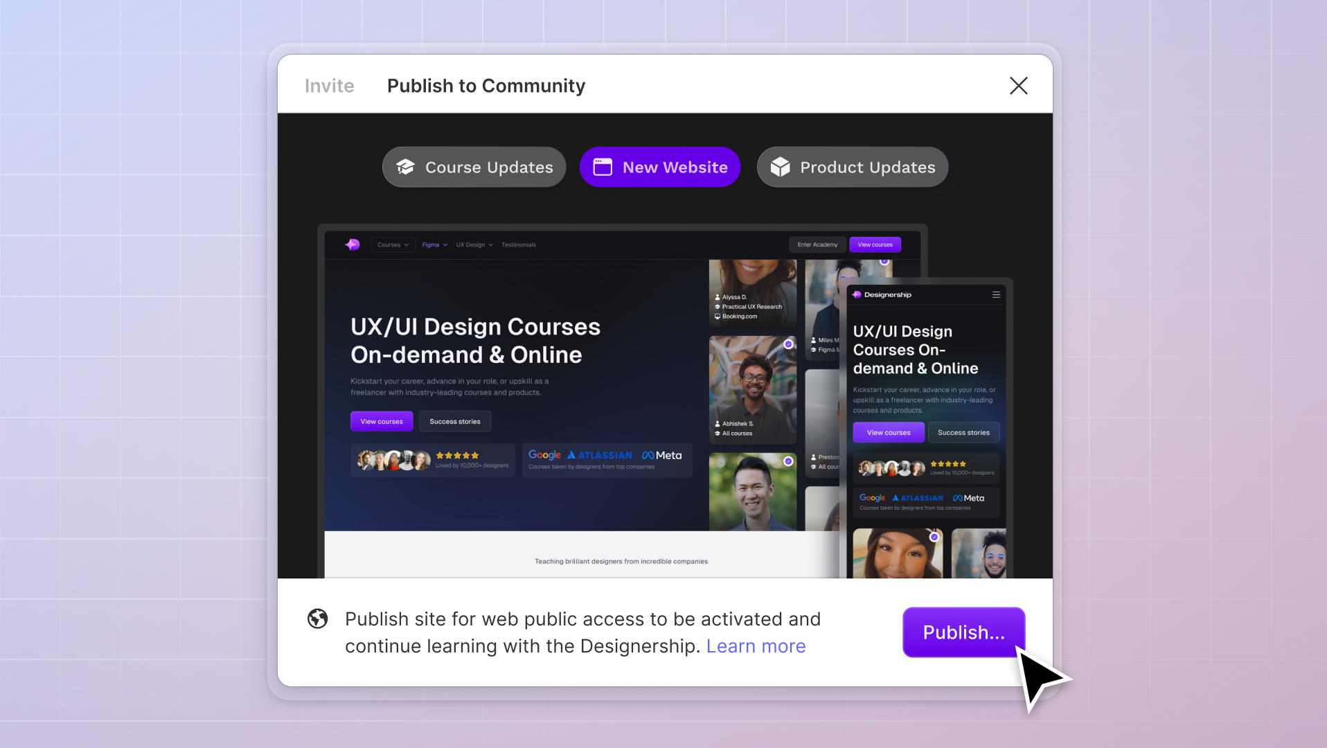
New website, course and product updates - April 2024
A lot happened this month. Take a look at what's coming.
Michael Wong
Apr 17, 2024
·
7 min read


There’s no denying it—bad typography sticks out.
Without a doubt, fonts are one of the most critical elements in UI design. Fonts will make or break a UI design.
The right font choice can work wonders for any design. It can communicate more to a user in a single glance than a wall of text or branding ever could while keeping them engaged.
Unfortunately, using the wrong font has the opposite effect. Even a slightly misaligned header will repel a user instantly or leave them feeling a little uneasy about the entire experience.
Lousy typography is easy to spot, even for non-design-oriented users. Even if they can’t pinpoint why, stakeholders, clients, and users alike may subconsciously know there’s something not-quite-right with your design.
That’s why understanding human psychology is a critical component of UX/UI design. You need to be able to anticipate the user's thoughts and emotions, then take steps in your design to solve them.
Needless to say, choosing the right font is a lot of pressure.
The rule of thumb for a good UI font is legibility, readability, and usability.
Legibility refers to how well one individual letter or character can be distinguished from another in a typeface.
Legibility is everything, and choosing the right font will significantly impact the overall user experience of your mobile apps. If someone cannot discern between an 0 and an O, or if they’re squinting trying to read a line of text, then it’s a clear sign of incorrect typography.
Readability refers to how words and blocks of text are arranged in a design. It’s all about spacing words and sentences to allow the user to easily interpret and understand content in a way that makes sense.
Your choice of font affects the readability of a text in several ways.
Misalignment, incorrect line length or hierarchy, and poor contrast affect readability. For example, if the tracking between characters is too high, or worse, too low, even the most well-written block of text is suddenly rendered useless.

Typography has to look good and be easy to read, but it also has to work well with the technical aspects of your design. How your font translates and adapts between smaller screens, larger screens, devices, light or dark modes, and even languages will affect how users interact with your design.
If the thought of fonts and typography has left you a nervous wreck, The Designership’s Shipfaster UI - Figma design system & UI kit will be your saving grace. Let us handle all the typography for you so you can spend more time creating game-changing designs.
To further understand typography and the importance of fonts in UI, let’s examine some key terms.
Another critical component of readability is having the correct number of characters on each line. Rather than letting the design dictate the characters, your main priority should always be legibility.
If a body of text has too many characters and becomes too wide, the user will have trouble focussing on the text and finding the beginning or end of a line.
If the text is too narrow, the eye has to travel back and forth rapidly, breaking a reader’s rhythm and encouraging them to skip lines.
There are some discussions about the optimal number of characters per line length.
According to Emil Ruder in “Typographie: A Manual of Design,” the optimum length for a body of text is between 50–60 characters, including spaces. However, many experts and designers argue that the optimal number is up to 75 characters.
Overall, the consensus is that around the 66-character limit per line is golden.
In design, you can maintain an optimal number of characters per line by restricting the width of your text blocks. This can be done using em or pixels.
Interestingly, a study conducted in 2005 found that the total characters per line (CPL) had only “small effects on readability, including factors of speed and comprehension.”
When asked for preferences, 60% of respondents in the study indicated “a preference for either the shortest (35 CPL) or longest (95 CPL) lines used in the study…at the same time, 100% of respondents selected either one of these quantities as being the least desirable.”
As a result, experts have said that the study proved that while there is a solid lean towards both ends of the spectrum, these extremes are equally disliked by the other. Therefore, the best option is to settle for the mid-range of around 60–70 CPL.
Display refers to a text style intended for use in large sizes. Think headers, by-lines, and other large copy, rather than for long-form passages of body text.
Base font size refers to the primary or default font size used in an app or a website.
Most modern UI designs use a base font size of 16px, and you’ll often see it used for body paragraphs, lists, or menus. 16px as a default is a good place to start, as it’s easily legible for users to read on a screen.
X-height refers to the distance between the baseline and the mean line of lowercase letters in a typeface. For example, a font with an x-height of 70% means that the baseline is 70% of the entire height of the font.
In UI design, generally, 68–69% is considered optimum for readability and legibility. Typefaces and fonts with tall x-heights are better legibility at small font sizes, as the whitespace within each letter is more legible.
Line height is measured in points or percentages of the text size and is most commonly used to set the required distance between lines of text. A rule of thumb says that the perfect spacing is 130%-150% for readability, but the ideal line height depends on its design.
Line height is essential in UI because it determines whether the text is readable or unreadable. For example, if line spacing is too large, there is too much white space, and reading becomes awkward. Too small, the letters become squashed, and legibility is reduced. You want to aim for that Goldilock ratio: not too small, not too large, perfectly readable.
For our Shipfast UI - Figma design system & UI kit, we don’t have any fixed line-height ratio. However, all line heights fall under the 4pt base grid to ensure that it aligns harmoniously and looks good.

As a general rule, body text should be between 1.5 to 2x the text size, depending on the width and length of the content. For example, if your body text is the standard base-font size of 16px, you would set the line height to 1.5 or 24px.
However, there is also an inverse relationship between appropriate line height and font size to complicate things. This means that the smaller the line height, the larger your text should be.
As a blanket rule for display text, try to between 1–1.25x. If your header is 60px, you’ll want to set your line-height around 1.2 or 72px. Always remember to use common sense, and if it doesn’t look right, make some slight adjustments.
“Serif” refers to the small line, mark, or “tail” that appears at the end of different letters. It’s become the collective name for fonts and typefaces that use serifs in their design.
Sans-serif is a typeface designed without serifs (its name literally translates from French to “without serif”). Sans-serif fonts are favored by UI designers the world over owing to their lower stroke contrast, larger x-heights, and overall reduced cognitive noise.
Grotesque was the first form of sans serif type, getting its name from its irregular and awkward shape. A more refined version of grotesque, called neo-grotesque, was popular in the mid-20th century. Some classic examples of Neo-grotesque typefaces include Space Grotesk and Work Sans (which we will explore below).
According to the official website for Accessibility for Teams, the best font for UI design is “a typeface that emphasizes clarity and legibility.”
Some designers believe that sans-serif and serif faces are the go-to for long-form reading for UI. However, this is not a hard and fast rule.
When selecting the right font for your UI design, answering these questions will help you to determine how legibly, readable, and usable a font will be:
Answering these questions will help rule out any fonts that don’t do their job. Just because it looks flashy or eye-catching doesn’t mean it will be a welcome sight for your user.

Inter is a Google font and easily the most popular UI design font. Created by Rasmus Andersson, Inter was brought to life as a side project by Andersson while he worked for Figma.
Inter has a very distinct look and has come to be known as a standard font within UI. For those supercharging their workflow and improving consistency within the design using our Shipfaster UI - Figma design system & UI kit, you might recognize Inter as the default font.
Inter shines through its excellent legibility, readability, and perfectly symmetrical characteristics in each letter. Sitting at an x-height of 69%, Inter has specifically been designed to have a tall x-height to aid in the readability of mixed-case and lower-case text.

Space Grotesk is a sans-serif neo-grotesque variant designed by Florian Karsten and based on the Colophon Foundry's fixed-width Space Mono family.
Known for its excellent readability at small and larger scales, Space Grotesk is a great option for font support for Latin Vietnamese, Pinyin, and all Western, Central, and South-Eastern European languages.
With a 70% x-height, Space Grotesk is great for legibility and works well on smaller scales and larger scales.
Many designers choose Space Grotesk as a font for projects involving Fintech or any tech branding owing to its iconic flared serifs—namely the “a” and the “r.” These little kicks and angles help to give this font its tech personality.

Work Sans was created by Wei Huang, a designer from Australia. This typeface was based loosely on a series of early grotesques, also known as sans-serif fonts, by designers Stephenson Blake, Miller & Richard, and Bauerschen Giesserei.
Work Sans sits a little higher at 75% x-height but still manages to read and scale well. Like Inter, Work Sans utilizes minor inconsistencies in the font letterforms to evoke a little personality without distracting.

Designed to read perfectly on a smaller scale with smaller text sizes, DM Sans is a low-contrast geometric sans serif Google Font. It was designed by the Colophon Foundry, which sprung from the Latin portion of ITF Poppins by Jonny Pinhorn.
DM Sans does not demand attention or become a centerpiece for a design. Instead, the slight details add a little bit of personality and flair to any design, especially lowercase. Sitting at 72%, this font still aligns with our desired ratio, and it’s a classic example of a sans-serif font at play.

Satoshi is a Fontshare font created by Deni Anggara.
A favorite of The Designership and used personally by many of our designers, including Mizko, Satoshi reads well in all cases, looks even better on a larger scale, and has brilliant readability thanks to its sharp contrast.
Satoshi does have a lower x-height of around 66%, so some notice the slight gap between the uppercase top and lowercase. In UI design, it’s better to opt for a font with an x-height of around 70% because, as you can see with Satoshi, the slight difference can lead to misalignment.

Lexend was expertly constructed to improve reading speeds, reduce visual strain, and make reading more accessible for those with dyslexia or other reading disabilities.
The first set of Lexend fonts, created by Thomas Jockin, were more tracked out than its newer, more refined variables.
In 2001, educational therapist Dr. Bonnie Shaver-Troup worked with Google to create the Lexend project. Utilizing her existing knowledge of the early Lexend font designs, Dr. Shaver-Troup created seven specially-designed fonts (Deca, Exa, Giga, Mega, Peta, Tera, and Zetta), which showed an immediate improvement in reading proficiency.
Lexend has since been integrated into UI design as an easily readable font with accessibility at the forefront, although some wider tracking variations (Peta and Zetta in particular) may be too clunky for smaller screens.

Another well-known and instantly-recognizable Fontshare font, Supreme was designed by Jeremie Hornus and Ilya Naumoff.
Supreme is a large family of constructed-style sans serif fonts. Supreme is a great alternative for other fonts as it helps to add variety and keep the eye engaged without distracting.
Originally only found in engineering and tech branding, Supreme has quickly gained traction thanks to its iconic double-story “a” and single-story “g.” It stands a little thinner than other fonts and has an x-height of 67%, but it still reads very well on varying scales.

Source Sans Pro is a Google Font and Adobe's first open-source typeface family.
Designed by Paul D. Hunt specifically for UI, Source Sans Pro is suited for multiple style variations, especially italics. It has a large x-height and a warm personality and is often favored by designers as a better font for body text.

With a tall x-height of 79%, Switzer is a great option for those looking for an alternative to the usual grotesque fonts. Switzer is a neo-sans serif font initially released as “Volkart” at Indian Type Foundry but was renamed and moved to Fontshare in 2021.
Some designers report that the “descender is quite wide.” This sometimes makes it a bit tricky on a one-word or one-liner, but this depends on whether you’re using lowercase or not.

Created by Steve Matteson, Open Sans is a font that has been in use for decades and has become a little controversial in the design world.
Optimized for web, app, and mobile interfaces, Open Sans has a 78% x-height (a little more than advised) but has excellent legibility characteristics.
Open Sans is a fail-safe font that has been battle-tested for years. However, overuse has made it a little outdated. For years, whether Open Sans is old-fashioned has become a controversial topic in design forums, but it’s a great font to have as your go-to.

Don’t want to use a third-party font? Good news, you don’t have to.
Some designers overlook the power of using system fonts in their design. These fonts are used natively to these devices and operate perfectly with optimum readability and legibility. A system font can do the job perfectly rather than getting caught up in the weeds trying to find an entirely unique font.
For Android, Roboto takes the stage. First designed in-house at Google by Christian Robertson to replace Droid as the Google system font for Android and Chrome, Roboto is a popular choice as a font for app UI design.
Designed to look good at scale and on a wide variety of screens, Google chose Roboto for a simple yet significant reason. While some grotesque fonts distort their letterforms, Roboto doesn't. That means there’s no compromise, which allows letters to be settled into their natural width and a more natural reading rhythm – like with humanist and serif font types.
For iOS, San Francisco is consistent and legible. A sans-serif font, iPhone users will instantly recognize this font.
With the release of iOS9, Apple ditched the long-used Helvetica Neue for their own in-house font that had been specifically tailored for maximum readability on small screens. In fact, the very first device to adopt the new font was the Apple Watch.
San Francisco and Roboto are often described as “close cousins.” Joshua Darden, the founder of Darden Studios, Joshua Darden notes that both fonts are eerily similar as they both share Helvetica as a reference point.
“Their use of relatively closed apertures (the areas partly or entirely enclosed by a letter form) and terminals echoes Helvetica,” he says.
So, does this mean that an experienced designer should move beyond system fonts into something more tailored or specific? Interestingly, many veteran UI designers would say yes. However, this regressive thinking doesn’t benefit anyone.
System fonts are the default for global brands for a reason—they work, and they work well. If you’re stuck on the perfect font, a system font is the absolute failsafe for legibility and readability.
For those looking to explore more options, spend some time browsing Adobe Fonts, Google Fonts, Font Share, and Fontspace.
Are you overwhelmed with fonts for UI design? Figma design system & UI kit system will help you out.
Let us handle all the typography for you so you can spend more time crafting meaningful experiences!
Mizko, also known as Michael Wong, brings a 14-year track record as a Founder, Educator, Investor, and Designer. His career evolved from lead designer to freelancer, and ultimately to the owner of a successful agency, generating over $10M in revenue from Product (UX/UI) Design, Web Design, and No-code Development. His leadership at the agency contributed to the strategy and design for over 50 high-growth startups, aiding them in raising a combined total of over $400M+ in venture capital.
Notable projects include: Autotrader (Acquired. by eBay), PhoneWagon (Acquired by CallRails), Spaceship ($1B in managed funds), Archistar ($15M+ raised) and many more.


.jpg)


%20(1)%20(1).jpg)