


What's New
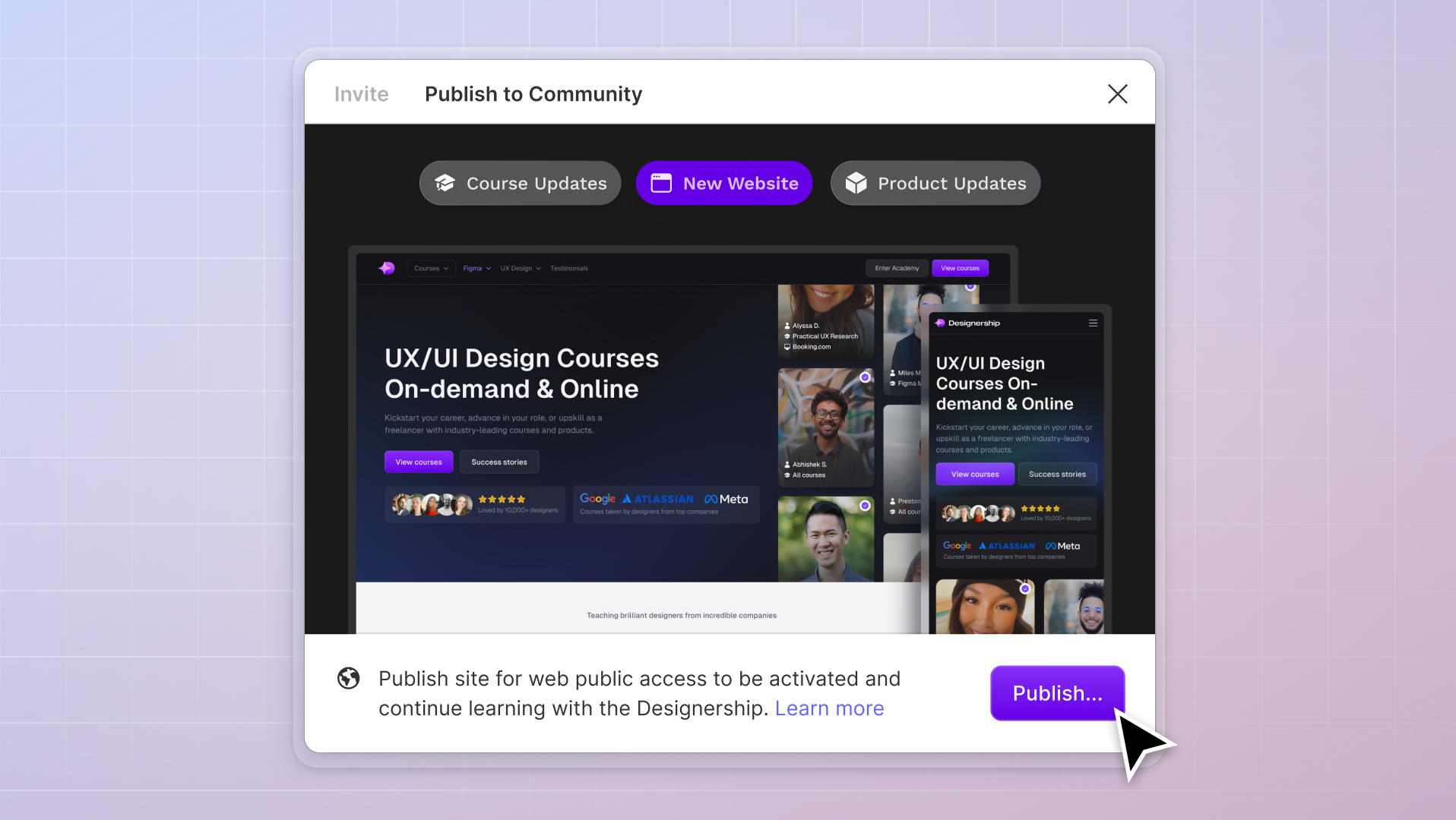
New website, course and product updates - April 2024
A lot happened this month. Take a look at what's coming.
Michael Wong
Apr 17, 2024
·
7 min read


In the world of UI design, achieving a consistent and polished layout is key. But, designers often need help with how things align and look.
This is where spacing in UI design comes in.
It bridges the gap between chaotic layouts and organized visuals. Proper spacing can transform your designs, and the 4-point grid system can help you tackle design challenges with precision and skill.

Imagine visiting a website where buttons shift around, or text appears cramped. These disruptions can interfere with the user’s experience and indicate a problem with spacing.
Spacing in UI design refers to arranging empty areas around and between components — such as text, images, buttons, and blocks.
It’s the breathing room that allows each element to shine on its own. At the same time, it adds to the aesthetic appeal and functionality of the design.
Spacing in UI design plays a pivotal role in achieving visual balance. It sets up a steady pattern that leads users intuitively through the interface, making everything feel connected and understandable.
The 4-point grid system is a framework that helps you place and arrange elements in your design with precision. The general premise is that whenever you create space between elements, it should be divisible by four (4, 8, 12, 16, etc.).

If you’ve designed websites or products in the past, you’ve probably heard of the standard 8-point grid. So, why use a 4-point grid instead?
Even though the 8-point grid is widely used, more granularity is needed. This is true especially when building denser interfaces involving more intricate elements and precise alignments.
The 4-point grid gives you more flexibility, accuracy, precision, and detail regarding spacing in UI design.
Whether you're tweaking the line height so that the text reads just right, harmonizing the placement of icons to make them pop, or even purposefully breaking the grid boundaries, it gives designers fewer constraints.
One of the most noticeable advantages of the 4-point grid system is that it acts as compass to enhance visual hierarchy and organization within your design.
Following the 4-point grid creates a sense of order and structure. Elements don't just sit on the canvas — they align with purpose and intent by following the grid lines with precision.
This draws the user's attention to pivotal points and accentuates the key components for a clean and well-orchestrated visual flow. The result? Designs that not only look appealing but also feel intuitive and fluid to navigate.
Proper spacing in UI design improves readability and the overall user experience, including better typography.
When text, images, and other elements are given appropriate breathing room, users find it easier to engage with the content. Adequate spacing between lines of text prevents overcrowding.
This makes the text easier to read. Users can then better understand the information without feeling stressed.
The 4-point grid system also brings remarkable efficiency to the design process. By using predefined measurements that align with the grid, you save valuable time that would otherwise be spent adjusting elements manually.
Think of devices with a 1.5x resolution. If you scale something sized at 5px by 1.5x, you end up with a tricky half-pixel problem.
While other even numbers might give too many options (like a 6-point system) or not enough freedom (like a 10-point system), the 4-point grid offers just the right mix flexibility without overcomplicating things.
By consistently using the right line height and bounding boxes, designers can provide clearer instructions. This clarity reduces back-and-forth, misinterpretations, or the need for revisions.
This consistency eliminates the need for constant fine-tuning and aligning. Designers can focus more on the creative aspects of their work rather than getting bogged down by tedious alignment tasks.
While the grid provides structure, it's also essential to know when to deviate from it. By intentionally stepping away from the usual structure, designers can introduce unique visual elements that may simplify and expedite the development process. This approach ensures that developers aren't always bound by constraints and can implement designs more swiftly.
Now that we’ve uncovered the benefits of using the 4-point grid system in creating organized and user-friendly designs, let’s dive into the practical aspect.
How can you use this system to make your designs shine? We’ve got some real-world examples to showcase the transformative effects of spacing in UI design on Figma.
In this mobile app design template, you can see how we apply a 16-pixel spacing to the bounding container element and the elements inside it.

If you look closely, something seems slightly off. This is because the spacing inside should be closer together than the spacing of the entire container element.

Here, we’ve adjusted the pixel spacing to 8, and you’ll notice it’s an improvement. The closer spacing makes everything look put together.
When you reduce it to 4 pixels, the design looks even more cohesive.
If we look at the container on both sides, which has 16 pixels of space, any element in between will have spacing less than 16 pixels and divisible by 4.
By starting with a bigger measurement and then making it more specific in values that can be divided by four, we ensure that the design looks consistent throughout the user interface.
However, that’s not always the case. Here’s another design example for listings.
The sidebar has a consistent 20-pixel spacing on both the left and right.
You’ll notice something interesting: a gap of 40 pixels between each section.
In this container, our goal now is to introduce some separation. We want to avoid assuming these elements belong to a single group. It’s important to remember that the separate blocks — like occasion, price range, style, and things to do — differ.
Designers often need help with the time-consuming and error-prone task of updating design elements across multiple screens or components. Additionally, effectively communicating design specifications to developers can be challenging, resulting in misunderstandings and inconsistencies.
On the other hand, developers spend a lot of time translating design specifications into actual code. Unfortunately, the design and final product can be inconsistent because of differing interpretations.
That’s where design tokens come in. This small yet vital UI information offers pre-defined values that can be applied across different platforms.
Design tokens are a shared language between designers and developers that simplifies the design-to-code process.
Here’s a breakdown of the benefits of using design tokens:
Long story short, they make everyone’s job easier!
Here are some tools that can help make using design tokens easier:
Figma recently launched Variables, their approach to managing tokens in UI design. This feature is useful for tasks like switching between device sizes while maintaining spacing, previewing text in different languages, and building interactive prototypes among others.

Tokens Studio Figma is a plug-in that creates systematic spacing throughout your UI designs.

If you’re looking for project management tools, Zeplin is handy. It manages your entire project, from grid layouts to design systems and all the project files.

If you’re looking for something more specific on the design systems side, check out zeroheight and storybook.
Proper spacing helps you achieve visual harmony, intuitively guiding user attention, and improving readability.
To make sure users have a great experience, it's important to find the right balance between keeping things evenly spaced and making sure elements fit well together.
One way to do this is by using the 4-point grid system. This system works by using spacing measurements that are divisible by 4, which helps elements line up neatly. The result? A design that's visually appealing and functionally sound.
For those seeking to master the art of spacing in UI design, Figma is an exceptional tool. Combining Figma with the 4-point grid system offers designers a robust framework to ensure well-spaced elements.
Enrolling in The Ultimate Figma Masterclass Course will open new design possibilities. Industry expert, Michael Wong, takes you through the end-to-end design workflow with practical, real-world exercises for a hands-on learning experience.
It empowers designers to enhance their skills and apply their newfound knowledge in real-world scenarios. The course’s engaging, step-by-step approach keeps learners intrigued and captivated.
And we don’t have to just take our word for it—our students have plenty to share.
Mizko, also known as Michael Wong, brings a 14-year track record as a Founder, Educator, Investor, and Designer. His career evolved from lead designer to freelancer, and ultimately to the owner of a successful agency, generating over $10M in revenue from Product (UX/UI) Design, Web Design, and No-code Development. His leadership at the agency contributed to the strategy and design for over 50 high-growth startups, aiding them in raising a combined total of over $400M+ in venture capital.
Notable projects include: Autotrader (Acquired. by eBay), PhoneWagon (Acquired by CallRails), Spaceship ($1B in managed funds), Archistar ($15M+ raised) and many more.


.jpg)


%20(1)%20(1).jpg)