


What's New
New website, course and product updates - April 2024
A lot happened this month. Take a look at what's coming.
Michael Wong
Apr 17, 2024
·
7 min read


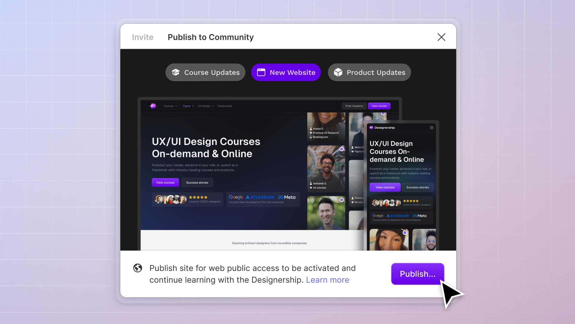
The Designership has gotten a makeover!
Here at The Designership, we are all about the success of our students and building a community of legendary UX/UI designers. That’s why we’ve spent countless hours researching, testing, and improving our site.
We’ve made a better website that’s better for you and the Designership community!
We want students within our community to be able to connect, feel inspired, and get the support they need on their journey towards success. Our new website has been designed to do just that. It’s the support you need, the tools you want, and the community to help you along the way.
A rebrand is not the only thing we’ve been working on.
We’re excited to announce a number of changes to The Designership that will help you level up your design game:
Let’s have a closer look at all the awesome stuff we’ve launched:

Along with a brand new, shiny website, we’re also super excited to announce the launch of version 2.0 of our Figma Design System: Shipfaster UI.
After the global success of our previous Figma UI Kit & Design System, Shipfaster UI 2.0 is here to make your life even better as a UX/UI designer.
Say hello to world-class, super responsive UI straight out of the box with our Figma UI Kit and Figma Design System.
We know that in design, details matter. We have made sure to only include battle-tested components built with precision and perfection in mind. That’s why the Shipfaster Figma UI Kit and Figma Design System is used by the biggest name brands in the world. That includes industry leaders like Verizon, Samsung, Discovery Channel, Zoho, and Shopify.
Let’s have a closer look at all the good stuff included in the Designership Shipfaster Figma UI Kit & Design System:

Every component is 100% responsive (say goodbye to design headaches!).
If you’re newer to UX/UI design and have been asking yourself questions like “what is Auto Layout?” and “how and why does Auto Layout help me design?”, then here is a quick Auto Layout explanation from Figma.
Auto Layout lets you add to frames and components, and create designs that grow or shrink depending on whether they need to fit or fill, and reflow as their contents change
“When you add Auto Layout to a frame, the items inside are stacked next to each other (either vertically or horizontally)” says Sho Kuwamoto, the Director of Product at Figma.
“The frame’s size is then determined by the total size of the items within it. Auto Layout frames can have their own padding, fill, stroke, and corner radius, so you can create buttons without adding additional layers.”
Auto Layout 3.0 makes UI simpler and easier which you’ll be able to take full advantage of with Shipfaster UI. It can be a little confusing for many, especially if you’re moving from Adobe or Sketch. If you haven’t made the shift to Figma yet, check out our deep-dive article, Figma vs. Abode vs. Sketch.
Some of the great features of Auto Layout 3.0 are that elements that are in a frame can now have individual padding values applied on all sides (no more design clutter!).
Before Auto Layout 3.0, a frame could only stretch in one direction. Now, you can select to have it autofill its parent container with ease. This works even if you’re trying to stack horizontal frames into vertical containers.

Thanks to our 4/8pt, every little detail snaps into place and things start to align magically.
As you start creating components on the page or screen based on this grid unit, there’s now less scope for any messy vertical misalignments. This is all thanks to a narrow set of variables.
Curious about 4/8pt and how it affects design? There’s an easy way to test this one out.
Begin by defining margins for the whole screen. Next, finalize which components are needed. This can include an input box, type scales, a picture, or even a set of icons.
After this, begin by fixing the size of high-level components into the multiple of 4. Don’t forget to also fix the line height for typography scales to the same multiple of 4. Now, start arranging those components with the spacing of a “4-pt grid”. If you’re working in Sketch, you can also set the horizontal and vertical grid layout with 4 pixels columns. This will help for easier adjusted spacing.
A pro-tip for designers is to count the spacing from the bounding box of the element. This is because counting from the baseline will not help developers at all. To keep things all in alignment, make sure to first fix the line height and bounding box for the rest of the components.
Designed with accessibility in mind, the Designership way.
Shipfaster has been designed in accordance with the Web Content Accessibility Guidelines (WCAG) 2.1. We believe in offering “accessibility guidance for three major groups: users with cognitive or learning disabilities, users with low vision, and users with disabilities on mobile devices”.
We believe that all designers deserve the same experience. That’s because we believe that everyone (and we mean everyone) can become a legendary designer.

With a huge Figma UI Kit collection of colors, gradients, typography, grid, shadows, and blur styles, you’ll be creating magic in no time.
As a UX/UI designer, it can be time-consuming to find and configure colors, gradients, and shadows for your projects.
That’s why we have built and pre-configured over 150+ global styles that you can use right away from our design system. This includes AA+ graded color palettes, gradients, and mesh gradients.
Rather than messing about with mismatching typography or colors, keep it simple with a set of styles designed to be styled together. Say goodbye to hours of hunting for colors to add to your designs. You won’t need to jump in and out of Figma anymore, because we’ve neatly packaged it all up for you.

As UX/UI designers ourselves, we understand how frustrating it is dealing with fake avatars, icons, and illustrations for your UI designs. That is why we have built-in over 2,800+ media resources you can use right away in your designs.
Get ready for a huge collection of pixel-perfect icons, avatars, logos, brands, vector shapes, device mockups, badges, and even payment icons. Design just got easy with a collection of profile photos with incredible backdrops, credit card icons, multiple icon sets and so much more.
The Shipfaster UI library of media resources will be particularly useful for anyone designing commercially. Need a logo? Got one. Want to show a client how their product looks on a mobile? Hello, seamless device mockups.
We spent a lot of time curating the perfect collection of Figma resources, including all of our favorites from our Figma UI kits and Figma Design Systems. Now, you’ll be prepared for any project that comes your way.

We hope your jaw dropped like ours did when we tallied up all our components and variants and realized we had over 6,000 ready to use, right out of the box! A mind-boggling 6,000+ components and variants, right at your fingertips. It’s true, Shipfaster UI does help you to streamline your designs by bringing you every component you’ll ever need.
Missing variants or components that are not quite right can lead to wasted hours, fiddly edits, or worse, a completely unintuitive design. Whether you’re working on a simple marketing website or a large-scale complex web app, you need the right stuff.
We’ve included extensive button sets, button groups, input fields, widgets, progress bars—when we say every component under the sun, we mean it.
In addition to an endless supply of components and variants, you’ll be over the moon to know that they are all 100% responsive and built with Autolayout 3.0. Harness the full power of Figma, and watch your designs come to life!

Shipfaster UI includes work experience custom-designed expertly crafted page examples that follow the best use of the Figma design system.
Added bonus: they are totally easy to customize.
It’s no secret that the best UX/UI designer learns from watching others. It’s one thing to see a design or hear about a process, and it’s another to actually roll up your sleeves and get designing
These examples not only help you work through any design blocks but also help you to learn better and be a better designer.
We know that when it comes to design, examples and detailed documentation help. Especially when you’re trying to wrap your head around something new like our new Figma UI kit and design system.
If you’re worried about missing a key step in a design or forgetting which component to use, worry no more! Because we have provided step-by-step instructions for everything.
Plus, if there is something you get stuck on or you’re still unsure about, you have access to the exclusive Designership community! Just ask for help, and your fellow designers will be happy to assist.
Ready to level up your designer game? Find out more: The Best Figma UI Kit & Design System

We also launched a brand new chapter for our Figma Masterclass: Prototyping and Animations.
In this new chapter of our Figma Masterclass, we cover everything including:
As designers ourselves, we know first-hand that one of the biggest challenges designers face when presenting work is the ability to craft meaningful UI motion in their prototypes.
Most stakeholders struggle to comprehend or be able to imagine what the interactions or flow of screens may look like in reality. It’s something that is super difficult to navigate as a newer designer. Without the right experience, it often leads to a lot of pushback and frustration for the designers.
If you have the right tools in your belt to be able to master prototyping, animations, and UI motion in Figma, you have an instant advantage above other UX/UI designers in the game.
Best of all, if you’re already a Designership student, you’ll automatically get access to this brand new chapter. Lifetime access to our courses and community is just further proof that we are committed to helping our students succeed.
Are you just as excited as we are?
Everything we create at The Designership is aimed at helping you become a better designer.
Shipfaster UI gives you the tools you need to design better and learn the design game better. You’ll be able to create consistent, good-looking, easy-to-use designs (straight out of the box!)
Along with the brand new Prototyping and Animations chapter in our Figma Masterclass, you can rest easy knowing you’ve got everything you need.
With the right equipment, and the entire Designership community behind you all the way, we can’t wait to see what incredible things you’re going to do.
Mizko, also known as Michael Wong, brings a 14-year track record as a Founder, Educator, Investor, and Designer. His career evolved from lead designer to freelancer, and ultimately to the owner of a successful agency, generating over $10M in revenue from Product (UX/UI) Design, Web Design, and No-code Development. His leadership at the agency contributed to the strategy and design for over 50 high-growth startups, aiding them in raising a combined total of over $400M+ in venture capital.
Notable projects include: Autotrader (Acquired. by eBay), PhoneWagon (Acquired by CallRails), Spaceship ($1B in managed funds), Archistar ($15M+ raised) and many more.


.jpg)


%20(1)%20(1).jpg)