


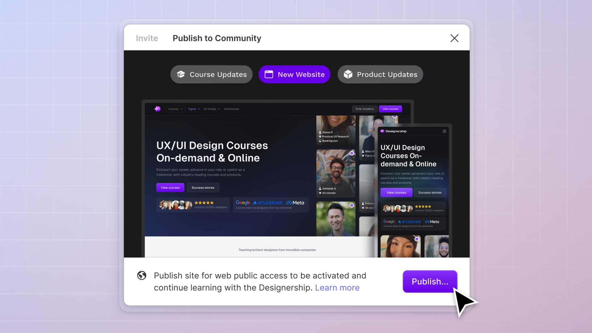
What's New
New website, course and product updates - April 2024
A lot happened this month. Take a look at what's coming.
Michael Wong
Apr 17, 2024
·
7 min read


Icons and icon sets are an essential and often overlooked part of UI design.
Icons have the power to communicate purpose, reflect brand voice, and explain specific concepts without overwhelming your user, all while fulfilling the role of user navigation.
But, first, let’s examine what exactly icon sets are and their role in UI design.

Icon sets are a group of icons that have been specifically created to look visually similar that can be easily implemented into your designs, much like fonts. Icons can be used anywhere, from social icons to navigation menus.
Using icons from the same family helps ensure visual unity and consistency in a design while achieving their ultimate goal: user navigation.
As a designer, you should always be aiming for uniformity and consistency. Hence, icon sets. Using more than one icon set in a design can confuse and disorient your users and leave a design looking messy or confusing. That’s why it’s usually best to stick to one icon style per project.
Using an icon set can benefit your design workflow in several ways, including:
There are several key characteristics to look for when selecting an icon set to add to your toolkit.

Although designers have many opinions and preferences regarding the solid vs. line icon argument, a good icon set should give you the option of both. This way, you can design which type of icon to use depending on the specifics of your design project.
According to Medium, solid icons may be more recognizable than line icons when representing the same subjects. On the other hand, line versions may be a better option for icons with more abstract meanings. As you become a more experienced designer, you’ll get a feel for which version works for which client or project.

It is more than likely that users will view your icons across various screens and devices. So, you need to ensure the icons in your icon set are scalable to consistent frame size. This way, regardless of the method of interaction (mouse or touch), you are ensuring usability.
Additionally, the consistent frame size is even more important because not all icons will be the same size due to geometric differences. Be sure to place them in a frame that has a consistent proportion throughout your design to avoid running into scalability problems.

Depending on the extent of your design project, you may require a wide range of icons.
Check how many icons are included in a set to ensure you have enough icons to use. If there aren’t enough icons, you risk needing to switch out midway through your design Remember, consistency is critical in UI design, so mismatched sets could ruin an entire project.
Of course, you also want to ensure your icon set doesn’t have too many icons. More often than not, this usually results in a drop in design quality as the number of icons in the set increases.
Finding the right number is a delicate balancing act, and finding that middle ground between variety and design consistency can be challenging. Be sure to use sets recommended by other designers, as is our list below.

Here’s an icon set that is a favorite of the Designership team—HeroIcons.
This icon set was created by Tailwind CSS, a very recognizable name amongst front-end developers. For those using Shipfaster UI, you might recognize HeroIcons as the icon set of choice.
HeroIcons works incredibly well with dark and light mode, has great scalability, and also comes with the option of both solid and line versions, complete with direct stroke access.

The Unicons icon set is yet another favorite from the Designership team and was selected as the icon set of choice for the Outline Wireframe Kit. Unicons is a free icon set also available as a Figma file.
One of the Unicons icon sets' most appealing features is how much variety you can get. There are over 1000 icons in the pack that you can implement into your design projects immediately, and the set offers four variants for each icon—line, solid, monochrome, and solid.

Created by Cole Bemis, Feather Icons is very popular with the Designership Team—and for a good reason. The Feather Icons set features an impressive collection of some of the most beautiful open-source icons available on the internet today.
Each icon focuses on simplicity, readability, and design consistency. Each icon =lies on a 24x24 grid, and they are well-polished and easily adjustable.
However, while the Feather Icons set has many great designs and details, there are some drawbacks. For one, the icon’s set naming system is not very user-friendly and can be challenging to navigate especially when you forget the name of something. Also, the line versions of the social icons could be better than their solid versions.

The Noun Project icon set boasts a collection of more than 3 million icons, complete with an advanced search system that makes it easy to find what you want.
This icon set is free, with the option to upgrade to some paid packages ($9.99 per month).
The best feature of the Noun Project is its excellent community support and input. They have a large community of creators from over 130 countries and a great collection of some of the icons and stock photography. Noun Project will be your saving grace for those looking for free stock images to use on projects.
Regarding its icon sets, some UI designers have reported that it may have been more convenient if icon sets retained their paths during export instead of expanding the paths into strokes. This way, editing icon shapes and stroke widths would be a little more straightforward.

The Material Icons Library is a free icon set for the Material Design system by Google.
Powered by the Slant community, the Material Icons Library contains a resource of over 1000 free icons in five variations — filled, sharp, rounded, outlined, and two-tone.
This icon set is pretty consistent and with a nice variety of options. However, some designers are reporting sizing issues with the set. In particular, the icons are too small when working with mobile.

The Phosphor Icon set is the brainchild of Helena Zhang and Toby Fried. This set features an extensive resource of consistent, scalable, and aesthetically pleasing icons.
The best part of this set is that the icons are super easy to pick up and plug into Figma design projects.
If you’re using the Figma plugin, you should note that line versions have a fixed thickness, which may cause problems if you resize the icons. A quick fix is to hit ‘K’ to preserve the ratio as you resize. You can also use a Skale plugin to resolve this issue.

Doodle Icons set is a free Figma community creation. The icons in this set are bursting with character and personality, and while it may not be your everyday go-to set, it’s an excellent set to have on hand for quirkier projects.
This icon set is a little smaller than other sets, but what it lacks in variety, it makes up for with consistency, scalability, and most of all, personality.

The FlatIcon icon set is another excellent resource for UI designers looking for stylish and minimalist icons. With this free icon set, you’d have access to over 5 million icons and stickers. Again, with Figma, all you need to do is copy and paste the icons.
Like the Noun Project, the FlatIcon library of icons also offers excellent searchability and has an interface that’s easy to navigate. One drawback with the FlatIcon pack is that free users cannot download vector icons in the SVG format. But, you can download other formats and simply convert them to SVG.

Iconly is another highly recommended icon set with a Figma plugin. This collection features over 600 icons that you can easily drag and drop in Figma, with a highly organized and easy to navigate the library.Iconly also has the Iconly 2.0 Glass Icon Set, for those looking for a slightly different color palette.
The most recent release of the Iconly icon set (version 2.3) contains full vector icons in five styles—light, bold, broken, bulk, and two-tone. Also, all its icons have a 24 x 24 grid.
Iconly is free, with the option to donate to the icon designers. But, if you use the icons for commercial projects, you’ll need to opt for the paid package.

Microsoft Fluent System Icons is an icon set used for projects across Microsoft.
These icons have a very “friendly” and inviting feel thanks to their rounded corners and simplified shapes. They also come in two variations—solid and lined.
While these icons are consistent in design, they can have scalability issues. Again, simply use the hotkey shortcut ‘K’ to keep them uniform as you scale.

Reshot is a free resource for icon sets created by Envato. Like many other icon libraries on this list, you’ll find a wide range of icon options on Reshot, with the opportunity to download in any format, including SVG.
With Reshot, there are no signups or payment limitations.

The Tabler Icon set from CodeCalm is a great destination for highly customizable, open-source icons.
This set offers designers almost 2000 icons with strong and consistent design styles for free, with no attribution required for commercial use. With these sets, you can easily adjust every icon's size, stroke, and color, with one tap to copy and paste to Figma.
Although they don’t yet have a Figma plugin, the team behind the Tabler Icon sets is incredibly proactive with development, constantly adding new resources and icons every week.

Ionicons is an open-source, MIT-licensed resource for creatively designed icons built by Ionic.
This library contains over 700 icons of some of the most common icons with three variations—line, solid, and sharp. While they may not have as many icons as other sets, their designs are super sharp, with consistent frame size.
They also include a Figma plug-in and support for SVG and web fonts, and a selection of icons ideal for all platforms, including iOS, Android, web, and desktop apps.

Iconic is another popular choice for consistent, scalable icons.
Created by the team behind Premium Pixels, Iconic has an interactive layout for exploring icons and their use cases. With 840+ icons and counting, you’ll appreciate the strong and consistent frame sizes and variety (they add ten new icons weekly). Unfortunately, they do not yet have a Figma plugin.
A drawback is that you’ll need to purchase a subscription for most icons, and only Line icons are available. They only have line icons on their website, so if you want to make them as fill icons, you need to remove the stroke and manually add fill color to it.

Streamline is an icon set resource of almost 100,000 icons (and counting) and illustrations.
The icons set of choice in wireframe kits like Wireframy, these icons are super consistent and easy to adapt to branding colors. Streamline also has a handy Streamline app, allowing designers to work mobile.
The team has recently fixed a Figma bug where PNG insertion in Figma artboards and colorization resulted in some problems with some illustrations changing to a strange dark color.

The SF Symbols 3 is an icon set resource from the Apple development team and has that classic iOS aesthetic.
It contains over 3000 icons and integrates seamlessly with San Francisco, Apple’s system font, so the symbols automatically align with text in all weights and sizes. The symbols come in nine weights and three scales and automatically align with text labels.
As a designer, the tools and resources you see play a significant role in the quality of design you achieve. Stocking up on high-quality design resources such as icon sets will help you create more consistent designs, better and faster.
You can also enhance your skills with a course such as the Ultimate Figma Masterclass or immerse yourself in the Figma and Designership YouTube communities. The more time you spend within the design realm, the more likely you will pick up tips and tricks that can supercharge your workflow and refine your creative eye for design.


.jpg)


%20(1)%20(1).jpg)