Every scroll, click, or tap can transform a user’s journey.
When not done right, these vital touchpoints can become friction points. They frustrate users and cause them to abandon the journey altogether.
Understanding and mastering these design patterns isn’t just a good practice — it’s absolutely critical to your design’s success. It separates a great design from a mediocre one, making your work stand out and delivering a seamless user experience.
Don't let overlooked details hinder your design’s potential. Dive deep into UI design patterns and utilize their power in your projects.
What are UI design patterns?
Imagine you’re building a house. Instead of starting from scratch, you have a set of tried-and-tested blueprints that homeowners love.
UI design patterns are just like those blueprints but for digital interfaces.
They are recurring solutions to common design challenges. For example, when you see a magnifying glass icon on a website, you instantly think, "search." That’s a UI design pattern in action.
The impact of effective UI design patterns
When UI design patterns are effectively applied, users don’t waste time guessing — they instinctively know where to click, swipe, or type.
This creates a ripple effect of positive outcomes:
Intuitive navigation: Users can easily find what they’re looking for. This reduces frustration and boosts satisfaction.
Consistency: Whether it’s a login form or a search bar, familiar patterns create a cohesive experience across different pages.
Increased engagement: When users feel comfortable and understand an interface, they’re more likely to engage, return, and recommend it.
Efficiency: Users can complete tasks faster and with fewer errors.
How UI kits and design systems can help
One way to make sure your UI design patterns are consistent is to use UI kits and design systems. A design system is a holistic framework that guides the overall design and user experience, while a UI kit has pre-designed UI components that can be used to implement the design system's guidelines in practice.
With constant updates and thousands of customizable components, create designs that stay ahead of the curve seamlessly. Pay once, and get instant access for life!
Common UI design patterns
In UI design, no strict rules tell you exactly how to design an interface. However, having a set of design patterns at hand can be invaluable.
While not prescriptive, these patterns offer valuable guidelines and solutions based on industry best practices and user experience research.
Let’s explore common UI design patterns to help you create modern, user-friendly interfaces.
1. Breadcrumbs
A clear example of breadcrumbs in a modern user interface, guiding users through a hierarchical website structure.
What is it: Breadcrumbs are like a map that helps users see where they are on a website. It allows them to go back to the main starting point if they want to.
They act as a secondary navigation tool that helps users retrace their steps.
For example, if you were shopping for men’s polos on Amazon, the breadcrumbs can be found on the top left of the page:
A screenshot of Amazon's website showing breadcrumb navigation on the top left corner, indicating the user's path from Clothing, Shoes & Jewelry to Men's Clothing to shirts to the Polos section.
They tell you that you started on the Clothing, Shoes & Jewelry, went to the Men’s Clothing, then shirts, and finally, you’re at the Polos section.
When to use:
When your website or website app has a deep hierarchy with multiple levels of pages or sections
To help users understand their current location within the website or app's structure.
When you want to offer users an easy way to navigate back to higher-level pages or the homepage.
Why it’s useful: Using clear visual cues on a website or app helps users find their way around the site. Breadcrumbs help users also provide context and get a sense of where they are in the overall site hierarchy.
Anatomy
The anatomy of breadcrumbs, showing the active state, slash, and current state.
Types of states
Active state: These clickable links display a user's path in an app or website. They usually show a sequence or timeline of the user's navigation.
Ensure these links are visually distinct and recognizable as clickable elements.
They should be styled to stand out from regular text but not overshadow the current page title.
Common styling choices include a different color, underline, or a cursor change on hover to indicate interactivity.
Slash: Acts as a visual separator between different links or pages in the breadcrumb trail. It helps present the path clearly and maintain a clean, organized look.
The slash should be visually subtle yet clear enough to distinguish each breadcrumb item.
Don’t make it overpower the text of the breadcrumbs.
Keep the spacing around the slash consistent for readability and aesthetic appeal.
Current state: Indicates the current page or position the user is on. It's the endpoint of the breadcrumb trail and provides context to the user.
The current state should be visually distinct from the active links to signal that it is not clickable.
It’s often styled using a different color, font weight, or left unlinked to indicate it’s the current page.
Make it bold or emphasize it to instantly communicate to the user where they are within the site structure.
Things to keep in mind
Start and end points: Your breadcrumb should start with the homepage and end with the current page you're on.
Keep it small and subtle: Breadcrumbs should be easy to see but not the main focus. They’re there to help, not to dominate the page.
Use simple separators: Use a basic symbol, like a slash (/), between links to keep things clear and uncluttered.
Highlight the current page: The last item in your breadcrumb, where you are now, should stand out and not be clickable.
What is it: A button is an element that triggers specific actions based on a user’s interaction
When to use
Call to action (CTA): A prompt or instruction encouraging users to take a specific action. In Duolingo, a button with a clear CTA (Get Started) prompts users to sign up and learn a new language:
Navigation: Allows users to move forward to the next step or page in a process or flow. When signing up in Gmail, for example, the “Next” button allows the user to proceed to the next step of the signup process:
Search: Triggers the search functionality and retrieves relevant results. When looking for stays in Agoda, pressing the “Search” button allows the search system based on the criteria inputted:
Sharing: Share content on social media platforms. You can find social media icons on Spotify in the lower right corner. These icons let you share your playlists on your social media accounts:
Other uses: Submit form, confirmation, filters and sorting, downloads and uploads, pagination, expand/collapse, play/pause, reset or refresh, toggle, and save or update.
Why it’s useful: Buttons help guide users through your interface. They highlight the most important actions they can take.
Identifying and using the right style for these actions is foundational to an effective user interface.
Anatomy
The anatomy of a button, showing the button label and icons.
Button Label: Shows the button's action name when pressed.
Icons: Put icons next to text or labels to make actions or choices stand out more.
Things to keep in mind
Understand the button's role: Each button should have a clear function, whether it's submitting a form, navigating to another page, or initiating an action. The purpose influences the design.
Determine the button’s visual importance: Primary actions require more prominent buttons, while secondary actions can be more subdued.
Organize button hierarchy: If you have multiple buttons, arrange them logically. Prioritize button hierarchy based on importance. Primary buttons (e.g., "Submit" or "Next") should be visually prominent. Secondary and tertiary buttons should be less eye-catching but still distinguishable
Choose the right shape & color: Buttons typically have rectangular or oval shapes to stand out effectively. Match button colors with their intended actions, such as green for "go" or red for "stop."
Add enough padding: Avoid overcrowding by adding adequate padding around button labels. Recommended padding is typically twice as much on the width as on the button's height.
Keep it consistent: This includes color palettes, icon styles, typography, and design choices.
Use legible typefaces: Button labels should be readable and easily recognizable as buttons. Avoid overly stylized fonts. Stick to conventions for clarity.
Provide feedback: When a user clicks a button, make it change in some way, like its color or size. This helps users know their click worked.
Types of states
Default: The appearance of a button when it's not being interacted with.
Ensure the button is easily noticeable and its purpose is clear.
It should communicate that it is an interactive component or element.
Hover: When a user hovers their mouse pointer over a button.
Implement a subtle color change or animation to indicate interactivity without being distracting.
The hover effect should be immediate to acknowledge the user's interaction.
Focused: When a button is focused, it indicates it currently has the user's attention.
Use a distinct border or background change to highlight the focused button.
It should meet accessibility standards with sufficient color contrast. This makes them easily visible and usable for all users, including those with disabilities.
Pressed: When a user clicks or taps a button, it enters the active or pressed state.
Create a distinct visual change, like a change in depth or color, to mimic a 'pressed' effect.
Make it clear that this is a temporary state and will return to its original state once the action is finished.
Disabled: Buttons can also be disabled, which means they can't be interacted with. They often appear grayed out or faded to signify that they are unavailable.
Create a distinct visual change, like a change in depth or color, to mimic a 'pressed' effect.
One common approach is to use a grayed-out appearance or reduce the button's opacity to indicate that it's disabled.
What is it: Small interactive or static elements used to label, categorize, or organize items using text to describe them.
Badges are commonly used in other components, such as navigation bars and tabs.
Badges can be as simple as a circle with a number to display a count or quantity linked to an element. This quick visual status update is commonly used for unread messages, notifications, or shopping cart items.
Another type that only shows an icon can indicate a status change or new notification.
Badges with a text label clarify, inform, and provide context to the badge's purpose.
When to use
Notifications: Indicates the number of unread messages, emails, or notifications. In Gmail, the red badge in the mail icon indicates the number of unread messages:
Status indicators: Show the status of an item or profile shortly and concisely. For example, the blue verified badge with the checkmark on Instagram and Twitter represents authenticity:
Filtering and sorting: Allow users to filter and sort content. When searching for accommodations on Airbnb, the search results show badges with prices and their respective locations:
Why it's useful: Badges serve as quick visual cues that help direct users' attention to important information, updates, or actions they need to take. They help keep users informed and engaged in relevant content or tasks.
Types of interactive states
Default: The standard appearance of a badge, often used to indicate a specific attribute or status
Active: Signifies that the badge is currently active or in use
Inactive: Indicates that the badge is not currently active or relevant
Anatomy
Label: Refers to the text or name attached to an element like a button or icon. It tells users what that element does or represents.
Supporting Icons: Visual symbols used with text or labels in UI design. They provide extra information or emphasis to make it easier for users to understand and interact.
Things to keep in mind
Make it clear: Your badges should have a straightforward purpose, so users instantly know what they mean.
Keep it consistent: Maintain a cohesive design across shapes, colors, and where they appear on your interface.
Limit text: If you use text, keep it short. Use one or two characters or easily recognizable icons.
Avoid overusing: Only highlight the most important information sparingly.
Use colors and opacity wisely: Solid badges should be used when immediate attention is required. Use shaded or lower opacity (15-20%) colors for badges to differentiate them from more urgent badges.
What is it: A date picker is a user interface element used in web forms to help users input a date or a range of dates.
For example, a calendar pops up when looking for a place to stay in Agoda, allowing users to select a date visually. This can include options for a single date or a range of dates:
When to use
Scheduling tasks
Making reservations
Filling out forms that require date information
Types of date pickers
Calendar date: Resembles physical and digital calendars, works well across devices, and is familiar to users, especially for date ranges.
Numerical or text input field: Often comes with auto-formatting and helper text for user guidance.
Dropdown date: Suitable for websites and desktops but may need to be more mobile-friendly due to space constraints and separate day, month, and year selections.
Scrolling date: Useful on mobile devices but less ideal for distant dates, as scrolling through decades can be time-consuming.
Timeline: Ideal for a short date or time selection on mobile devices. It often comes with a drag-and-drop feature.
Anatomy
Date field: Displays the date which lies in that month. An event dot additionally accompanies it.
Range start/end: Allows the selection of multiple dates to define a range.
Selection: Highlights dates within the chosen range.
Why it’s useful: Date pickers are a simple method of entering dates.
People use different formats around the world. Some countries use month/day/year (mm/dd/yyyy), while others are more familiar with day/month/year. These differences may seem small but can interfere with the user experience.
Date pickers eliminate the need for users to remember specific date formats and reduce the likelihood of input errors.
Things to keep in mind
The simpler, the better: Remove unnecessary elements to enhance readability and user-friendliness. Provide format hints within the input field or nearby.
Set useful defaults: Use logical default dates such as the current date or the end of a financial or calendar year.
Break date fields: This helps screen reader and keyboard users navigate efficiently. Add a calendar icon or button to allow users to pick dates visually.
Display the month and year on top: This makes it easier for the user to navigate and shift between months and dates.
Keep the custom date ranges relevant: For example, a date picker for a reservation will make sense to set in the present and future, while a date picker for a birthdate will be set in the past.
Make the user behavior intuitive: It should work seamlessly with touch, mouse input, screen readers, and keyboards.
What is it: A file uploader allows users to upload files to a server or cloud storage. It can be found in forms or as a standalone element.
When uploading a post on Instagram, for example, users can drag photos and videos or click a button to upload files:
When to use:
Submit documents
Upload images
Attach files to emails
Types and states of file uploads
There are two main types:
Default file uploader: Users click to browse their device for files.
Drag-and-drop file uploader: Users drag files directly onto the user interface to upload.
File uploads usually start with a prompt telling users where and how to upload their files.
Anatomy of file upload prompts
Leading icon: A visual symbol or graphic that indicates the file upload action quickly.
Prompt title: The main heading or instruction for the file upload.
Prompt description: Additional information or guidelines about the file upload. This can include what type of file formats or size limits are allowed.
File button: A clickable button that users interact with to start the file upload process.
On the other hand, a file upload state shows what's happening with the file once it's being uploaded. This keeps users informed about the upload process from start to finish.
Anatomy of file upload states
Leading icon: Shows the file type or any supporting icon.
File details and progress bar: Shows the file name, size, and an optional progress bar.
Cancel icon: Optionally add a cancel file upload icon to dismiss the process.
Why it’s useful: File upload tool components simplify transferring files, such as photos, documents, or videos, from a user's device to a remote server or cloud storage.
By enabling easy file addition, file uploads make the upload process smoother and more intuitive.
Things to keep in mind
Provide clear labels and descriptions: Use concise, one-line labels to inform users about what they must upload. Provide descriptions to communicate file size or format limitations.
Make the drag-and-drop intuitive: If using a drag-and-drop uploader, mark the drop zone area with text instructions for dragging and dropping files or clicking to upload.
Show file details and progress: Display the name, type, and size of the uploaded file, along with a progress bar to indicate the upload status.
Handle long filenames: Use an ellipsis (…) to truncate filenames that are too long for the width of their container.
Include supporting icons: Use leading icons to indicate the file type or provide additional visual cues.
What is it: Advanced versions of the traditional text box. Unlike standard input fields that only allow for basic text (names, email addresses, or passwords), rich input fields include functionalities like auto-complete, formatting options (bold, italic), embedded links, or integrated dropdowns.
For instance, a rich input field lets the user copy the YouTube link directly when sharing a YouTube video. This removes the step of highlighting the link and right-clicking to copy it:
When entering a password in Paypal, there's a button to check if you've typed it correctly.
Why it’s useful: Today's digital world has moved beyond simple input fields. Now, we have rich input fields that make filling out online forms faster and more accurate. These fields are not just for typing in text — they can do much more.
Rich input fields help reduce mistakes and can handle different types of information. This makes the user journey much easier for users.
Things to keep in mind
Select the appropriate ones: The suitable types of rich input fields will be based on your needed data.
Make it simple: Provide clear instructions and labels to make all rich input fields user-friendly.
Provide instant feedback: This allows users to understand that there’s a mistake in the data entered or if a specific format is required.
Utilize placeholder text: Use placeholder text to give examples or hints about the required data format.
What is it: A loader is a visual feedback component that helps inform users that a process is underway. This is often used when retrieving data or performing slow computations.
When a page is loading in Google Chrome, it is indicated around the page logo in the tab:
On the other hand, a progress bar provides feedback about the duration of a process or journey. The visually show users how long they must wait for a process to finish.
A progression bar acts as a guide that shows users how far they’ve come and what’s left in a multi-step process. This is used in scenarios when the duration is known.
When answering a survey in Typeform, there is a progress bar to indicate the progress and how far:
Skyscanner uses a loader and a progression bar to visually show users how long they must wait while the system searches for flights:
When to use
Loaders
Initial page or app loading: When a user first opens a webpage or app, a loader indicates that the content is loading when a user opens a webpage or app.
Loading data: In scenarios where data retrieval might take time, loaders inform the user that the process is underway.
Processing user actions: For actions like submitting a form, sending an email, or performing an online transaction, loaders indicate that the user's request is being processed.
Image or media content loading: On platforms with heavy media content, like photo galleries or video streaming sites, loaders are used while images or videos are buffering.
Types of loaders and progression bars
Determinate: A process with a defined duration, such as a file conversion
Indeterminate: Unquantifiable tasks, such as loading a file
Types of states
Active state: This is the default state of the loader or progress bar when it's actively indicating that a process is in progress.
Success state: When a process is completed, the loader or progress bar may transition to a success state. This state can include a checkmark or a positive message to inform users that their action was successful.
Error/failure state: In case of an error or failure during a process, the loader can transition to an error state. It often displays an error message or an "X" icon to alert users that something went wrong.
Paused/idle state: Some loaders may temporarily pause or become idle if the process they represent is paused or waiting for user input. This state indicates that the process can be resumed or requires user action.
Anatomy
Loader
Spinner: A visual aid that animates when it's loading.
Description: Optional text that adds feedback to the loading status or lets users know what's happening.
Progress bar
Label: The process or journey the progress bar refers to.
Progress bar: Consists of the background field (refers to the total length of the process) and the indicator (refers to how much the process or journey is complete.)
Caption: Provides additional information to be shown, such as file size in case of a file upload.
Why it’s useful: Loaders and progress bars are crucial for managing user expectations during time-consuming processes.
They provide users with information and feedback about on-page actions, and they can assist users in case of errors.
By reassuring users that their action or request is being processed, loaders are crucial in keeping users engaged even though it’s taking some time.
On the other hand, progress bars help them know what to expect and feel more committed to finishing a task.
Things to keep in mind
Minimize display time: Aim to show the loader as quickly as possible to keep the user experience smooth.
Provide a time estimation: Give users an idea of how long they might need to wait.
Explain the reason: For loaders, explain to users why there’s a delay. This will make the waiting process less frustrating.
Choose the right type: Utilize determinate progress bars for tasks with a known duration and indeterminate for tasks with an unknown duration.
Share percentage or progress amount: This clarifies the user's current status so that they can make informed decisions about their next steps.
Provide additional context: Use labels and captions to give more information about the task.
What is it: A time picker allows users to select a specific time or duration.
For example, when scheduling meetings in Google Calendar, users can use the time picker to choose the meeting's time and duration:
When to use
Time pickers are used to set appointment times, alarms, or schedule events.
Anatomy of a time picker
Time input: The user can input specific hours, minutes, and seconds for their setting.
Separator: Spaces between the hours, minutes, and seconds that help differentiate each.
Time input label: Labels like "Hours," "Minutes," and "Seconds" guide users on what to put in each section of the time input.
Time period: Buttons to choose between "AM" or "PM" for the time you're setting.
Why it’s useful: Time pickers offer users a clear and visual method to input time information. They simplify the process of entering time, making it more intuitive and less error-prone than typing out the time manually.
This is important in scenarios where precise time input is crucial, such as booking systems or time-tracking applications.
Things to keep in mind
Default to common times: Users are more likely to find their desired time without manually scrolling or inputting it, saving them time and effort.
Show AM/PM clearly: Avoid confusion by making it easy for users to distinguish between AM and PM times.
Provide feedback: This helps users be sure that their input has been recorded accurately.
Allow for easy corrections: Make it simple for users to correct mistakes by allowing them to click back into the time picker and change their selection.
What is it: Data visualization presents complex data through visual elements.
Some common examples include:
Stat: This component effectively displays statistics and numerical data. This is particularly useful when there is a need to display statistics that may change over time.
For instance, when users check their daily step count on an iPhone, they can see the numbers compared to the previous day's step count.
Table: A table organizes and presents data that is relative. This enables user interactions like selecting, adding, deleting, and reordering.
On a Clickup task, for example, the table shows the project status, the stakeholders or team members involved, and if it is highlighted as urgent:
Why it’s useful: Data visualizations are incredibly useful because they organize data neatly, make it visually appealing, and help users understand the information.
When to use: Stat components display key numbers or data points clearly and effectively. They highlight essential metrics such as price drops, total sales, current user count, and progress toward a goal.
On the other hand, tables are helpful for a long process or journey that can take a considerable or unknown amount of time. They give the users a visual show of the process overview and constant feedback about where the user is in the journey or how long it can take to complete it.
Anatomy of stat
Leading icon: Adds a leading icon to support the type of statistical data.
Stat content: Combination of overline, label, and description text to set the context of stat. The label is often used for showing the numbers.
Badge: Optionally add a badge to show a positive, neutral, or negative change in data.
Anatomy of a Table
Column header: Used for indicating the column heading. This can be optionally paired with actions like checkboxes or arrange arrows.
Leading cell: Used for showing the first (i.e., leading) column in the table. This is usually placed in the leftmost column.
General content cell: Comes with a variety of content types and is used for all other cells in the table.
Things to keep in mind (Stat)
Label clearly: Use label text effectively to show the data directly. This allows users to have an immediate understanding of the represented data.
Provide contextual information: Always set a context for the displayed data. This can be achieved using a Description text field that provides additional information or insight into what the data represents or implies.
Explain periodic data changes: If the data is subject to periodic changes, accompany the stat component with a badge component to highlight the change — whether it’s an increase, decrease, or other relevant status.
Things to keep in mind (Table)
Make content editable: Make it easy for users to edit table content when it makes sense and improves their experience.
Give proper feedback on interaction: Utilize visual cues such as color changes, highlights, or tooltips to indicate selection or other available actions. Shipfaster 2.5 includes all the required states, like usual, active, and hover.
Provide sorting and filtering: If your table contains significant data, provide sorting and filtering options to help users quickly find the necessary information.
What is it: An inline alert is a type of alert message placed directly within the content, as close as possible to the item it relates to.
It provides timely information or feedback to the user, whether generated by a user’s action or the system itself.
When you enter an incorrect password on PayPal, an inline alert immediately appears, informing you of the error and encouraging you to make another attempt:
When to use
Inline alerts are often used alongside field-level error messages in forms or input sections. They provide precise information or feedback during a user's journey.
Some examples of when to use inline alerts include:
Form validation: When a user submits a form with errors, such as missing required fields or incorrect input formats, you can use inline alerts to display specific error messages next to the respective fields that need correction.
Password strength: When users create or update their passwords, you can provide inline alerts that dynamically assess the password’s strength, offering guidance on creating a stronger password.
Confirmation messages: After users submit a contact form or save changes in their profile, inline alerts can confirm the successful action. For example, "Your message has been sent" or “Changes saved successfully.”
Error messages: In cases of failed login attempts, incorrect inputs, or issues during a transaction, inline alerts can inform users of the problem and provide instructions on how to resolve it.
Subscription or purchase confirmation: After users subscribe to a service or make a purchase, you can display an inline alert confirming their subscription or purchase details, along with any relevant information.
Why it’s useful: Providing immediate, context-specific feedback helps guide users through a process. This notifies them of errors or important information without taking them out of their current context.
Anatomy of an inline alert
Label: Indicates what the alert is about in short. It also can be accompanied by a leading icon for visual support.
Dismiss icon: This allows users to dismiss the alert.
Description: Provides more information on the context if you want to explain the alert briefly.
Actions: Adds related actions the users can take.
Things to keep in mind
Give proximity to related items: This helps provide context-specific feedback and makes it easier for users to understand what the alert refers to.
Placement in forms: Place inline alerts either at the top or at the bottom of the form, depending on the nature of the message and the layout of your form.
Establish a consistent color scheme: This will help differentiate the importance levels and maintain uniform icons.
Keep it short and straightforward: When designing guidelines for the in-line alert system, specify the maximum number of characters allowed.
Don’t obstruct content: Ensure inline alerts don’t block or hide other content on the page. They should blend smoothly into the design layout.
Be cautious about when and what to send: Avoid overwhelming users and carefully evaluate the context and use cases.
What is it: A modal is an element that pops up above the main content to capture the user's focus for a specific task or important information.
When you sign in to the Everand subscription app, they request permission to utilize the sign-in information you previously used on Scribd, their earlier app, before allowing you to proceed:
When to use
Modals are useful to use in the following scenarios:
Onboarding new users
Sharing urgent notifications
Confirming important user decisions — especially for irreversible actions
Why it’s useful: Modals support a user-centered design approach by streamlining interactions.
This is particularly useful on user tasks, delivering a non-intrusive yet powerful method to present information that requires immediate attention or action.
Here are some of the benefits of modals:
Focused attention: They create a focal point for users by ‘graying’ out the rest of the application and drawing attention to a central task. This is important when the user needs to focus on an important action without distractions.
Immediate action: Modals often prompt users to take immediate action. This immediate call to action can be crucial for the user's journey and the functionality of the app or website.
Space-saving: Modals can save valuable screen real estate. Instead of moving to a new page for small tasks or additional information, a modal can overlay the current content, keeping the user in the same space.
Critical alerts and information: Modals can serve as a way to deliver urgent alerts or critical information that users must acknowledge before proceeding, ensuring that important messages are not overlooked.
Anatomy
Leading icon: Supports the modal message visually.
Modal details: Group of title and description which conveys the modal's context and information.
Dismiss icon: Optionally lets users dismiss the modal.
Actions: Adds necessary actions that the user can take.
Things to keep in mind
Clarity is key: Make sure the modal serves a clear purpose and is necessary. Overusing modals can frustrate users if presented too frequently or without a good reason.
Keep modals succinct: The size should be appropriate for the content, large enough to be readable but not so large that it overwhelms the screen or hides too much of the underlying content.
Make it legible: Text and interactive elements within the modal should contrast sufficiently against the modal background for easy readability.
Provide a clear description: It’s important to share the context of the action being done by the user and offer explanations regarding any potential consequences it might have. Make sure that the leading icon, title, and actions reflect this.
Visible dismiss control: Make sure there is a clear and visible way for the user to dismiss the modal, even if they choose not to complete the task.
Avoid nested modals: This creates a confusing user experience and makes it harder for the user to understand the required action.
What is it: A range of elements that enable users to interact with and make selections within a form. It allows users to perform actions such as selecting, multi-selecting, or toggling between different states.
Types of format
Three primary types of form controls include:
Radio Buttons: Used for mutually exclusive choices, where a user can select only one option from a group. When signing up on Facebook, you'd find radio buttons for options including "Male" and "Female”:
When signing up on Facebook, you'd find radio buttons for options including "Male" and "Female”:
Toggle: A toggle is a binary control that allows users to switch quickly between two possible states. This is often represented as an on/off switch.
Think of changing the app notification settings on your Apple phone. You can switch sounds and badges on or off using the toggle switch:
Checkboxes: Used when users need to select multiple items from a list.
For example, you'll see checkboxes next to Featured Brands in the product filter section on Amazon. When searching for headphones, you can tick the checkboxes for all brands you’re interested in:
Why it’s useful: Their design and implementation impact the effectiveness of user input, the efficiency of task completion, and the overall satisfaction of the user.
Here's why form controls are so important:
User input: They provide users with a means to enter and edit information within an application. This can range from filling out personal details on a sign-up form to entering search queries or adjusting preferences in a settings menu.
Functionality: Any task requiring user decision-making will likely involve some form of form control.
Better user experience: Well-designed form controls enhance the overall user experience by making the interaction intuitive and efficient. For instance, a well-placed checkbox can simplify a task requiring multiple steps.
Anatomy
Control field: Select from a list of 3 types of controls — radio, checkbox, and switch.
Label: Refers to the context of control.
Description: Provides additional information on the control that helps the user perform the specific action easily.
Things to keep in mind
Consider the contextual use: Make sure that form controls are used appropriately, such as within forms or settings pages.
Give feedback on interaction: Utilize the 'active' or 'selected' state variants to provide users immediate feedback when interacting with a control.
Have clear and accessible labels: This makes it easier for them to understand the purpose of each control.
What is it: An avatar, also known as a user pic, represents a user or an organization within a digital platform.
In Spotify, you can see your avatar in the top right-hand corner. You can find important profile information, such as accounts, settings, etc:
Types of avatar
Avatars can take various forms, including:
Blank (Empty state): A default placeholder used when no specific avatar has been assigned or uploaded.
Initials: The user’s initials, provide a simple and personalized touch when a photo or image isn’t available.
User’s photo or image: A personal or branded image representing the user or organization.
Avatars can be customized in various colors and sizes to suit different contexts and design requirements. They are often used in social media, chat applications, and online communities.
Why it’s useful: Avatars offer a quick visual reference, helping users easily identify themselves or others on a platform. They also allow users to personalize their profiles or accounts, making the platform more individualized and engaging.
When to use
Avatars provide a quick way for users to access their profiles and settings. They help users identify other individuals or organizations within the platform.
Things to keep in mind
Have fallback options: In instances where a user’s photo is not available, fallback to displaying their initials. If initials are also not an option, use a blank or default avatar.
Use status indicators: If applicable, integrate status indicators into the avatar design:
Use a green color to denote an online status and gray for offline.
Employ filled shapes for online status and empty shapes as a choice for offline.
Apply a diverse color palette and size variations: Consider diversifying the color palette for better visual recognition. Adapt avatar sizes based on their application within the UI:
Use 40–48dp avatars within content blocks or lists.
Employ 24–40dp avatars in headers, app bars, etc.
For profile pages, settings, and similar templates, opt for larger avatars, 56+dp in width.
UI design patterns: The key to designing efficient
UI design patterns is the foundation for crafting intuitive and engaging user experiences. They provide a tried-and-true framework that allows UI designers to create functional, user-centric interfaces.
That’s why it's crucial to grasp the purpose of each UI design pattern and recognize when to apply the appropriate patterns tailored to your specific audience and objectives.
Save time and escape the design grind
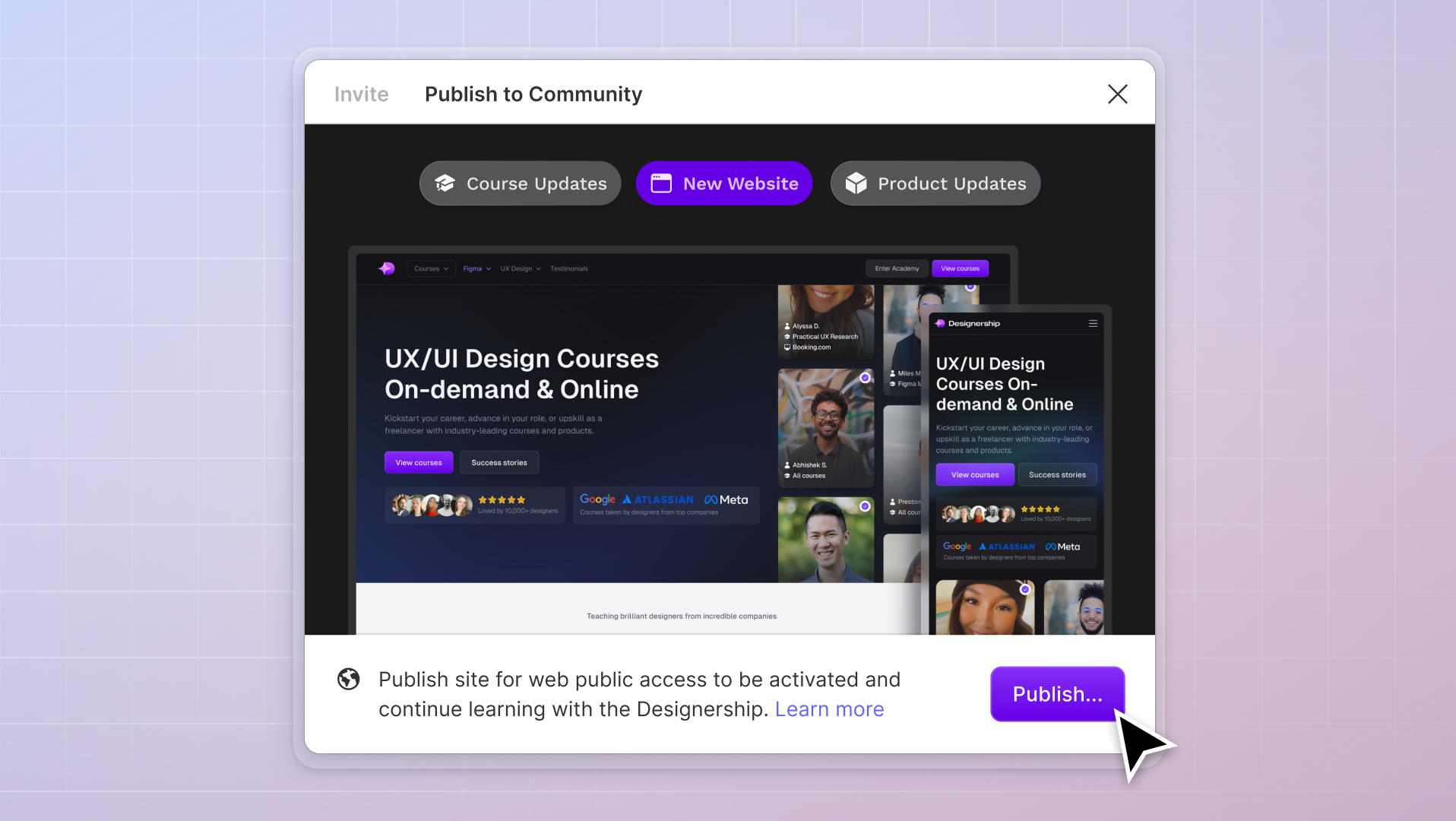
A sneak peek of the ShipFaster 2.5 interface showcasing its latest components.
Constant component recreations and the exhausting battle with manual tweaks – are just some of the frustrating time-eaters that every UI designer deals with.
Speed up your design process with our Shipfaster 2.5: UI Kit & Design System. No more starting from scratch — get lifetime access to 8,000+ customizable components, 2,800+ media resources, and hundreds of other pre-made styles and templates.
Our team is constantly updating it with new components, variants, and refined states. That way, your design projects are always equipped with the latest tools and resources to deliver exceptional user experiences.
More than just a toolkit, Shipfaster 2.5 stands as a gold standard in UI design — it’s trusted and vouched by thousands of designers. Why settle for less?
Don’t just design. Design smarter, faster, and better.
Michael Wong
Founder of Designership & z0 Studio
Mizko, also known as Michael Wong, brings a 14-year track record as a Founder, Educator, Investor, and Designer. His career evolved from lead designer to freelancer, and ultimately to the owner of a successful agency, generating over $10M in revenue from Product (UX/UI) Design, Web Design, and No-code Development. His leadership at the agency contributed to the strategy and design for over 50 high-growth startups, aiding them in raising a combined total of over $400M+ in venture capital.
Notable projects include: Autotrader (Acquired. by eBay), PhoneWagon (Acquired by CallRails), Spaceship ($1B in managed funds), Archistar ($15M+ raised) and many more.
What's the difference between qualitative and quantitative methods in UX research? Learn how to choose the best approach to enhance your user experience design in 2024.
Unlock the secrets of UX success with our in-depth guide on primary and secondary research methods. Discover tools, strategies, and examples to elevate your user experience design projects. Perfect for beginners and seasoned professionals alike.
Dive into the future of UX/UI design with our comprehensive guide for 2024. Discover cutting-edge trends, tools, and techniques that will shape the industry and empower you to create stunning, user-friendly designs.
Discover the 16 best UX research tools in 2024. From analytics to user testing, our guide helps you choose the right tools to elevate your user experience research and design.
Uncover the diverse world of UX research methods. From user interviews to usability testing, learn how different techniques can enrich your UX design process for optimal results.
Unlock the full potential of Figma with our ultimate guide. Dive into the world of UI design and discover how Figma's powerful tools can transform your design process.
Master the art of UX research with our ultimate guide. Explore methodologies, utilize the best tools, and adopt industry best practices for impactful user experience research.
Michael Wong
Dec 8, 2023
·
15 min read
Join our newsletter
Get the latest updates, exclusive offers, and more straight to your inbox!
WELCOMESHIP5
Copy
Oops! Something went wrong while submitting the form.
By subscribing you agree to with our Privacy Policy and provide consent to receive updates from the Designership. Spam-free and un-subscribe anytime.
Get 10% off on your first purchase
By subscribing to our newsletter you will be the first to hear about early access periods, discounts and more.
Thank you for subscribing
Oops! Something went wrong while submitting the form.
By subscribing you agree to with our Privacy Policy and provide consent to receive updates from the Designership.


.jpg)


%20(1)%20(1).jpg)